2 0 2 4 - l o g o & b r a n d i n g d e s i g n
Video Marketing agency focused on targeting other financial services firms for media productions.
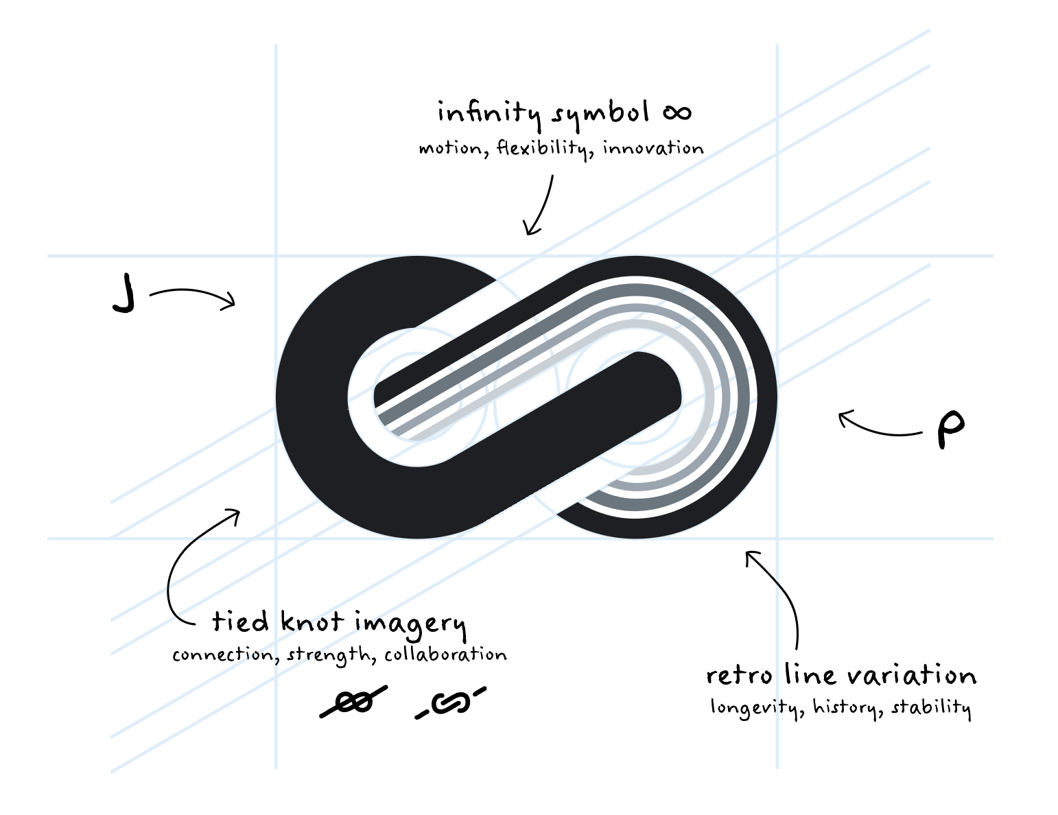
Funky, professional, and accessible logo suite, with a simplicity that suggests "We adapt to you, not our own style"
Funky, professional, and accessible logo suite, with a simplicity that suggests "We adapt to you, not our own style"


Expanded four-season color palate, using cyclical symbolism to show the company's flexibility and adaptability.
Cool gray "J" to establish consistency and recognition, paired with varying tones of the four main colors:
Blue = Winter, Green = Spring, Yellow = Summer, Red = Fall
Blue = Winter, Green = Spring, Yellow = Summer, Red = Fall
